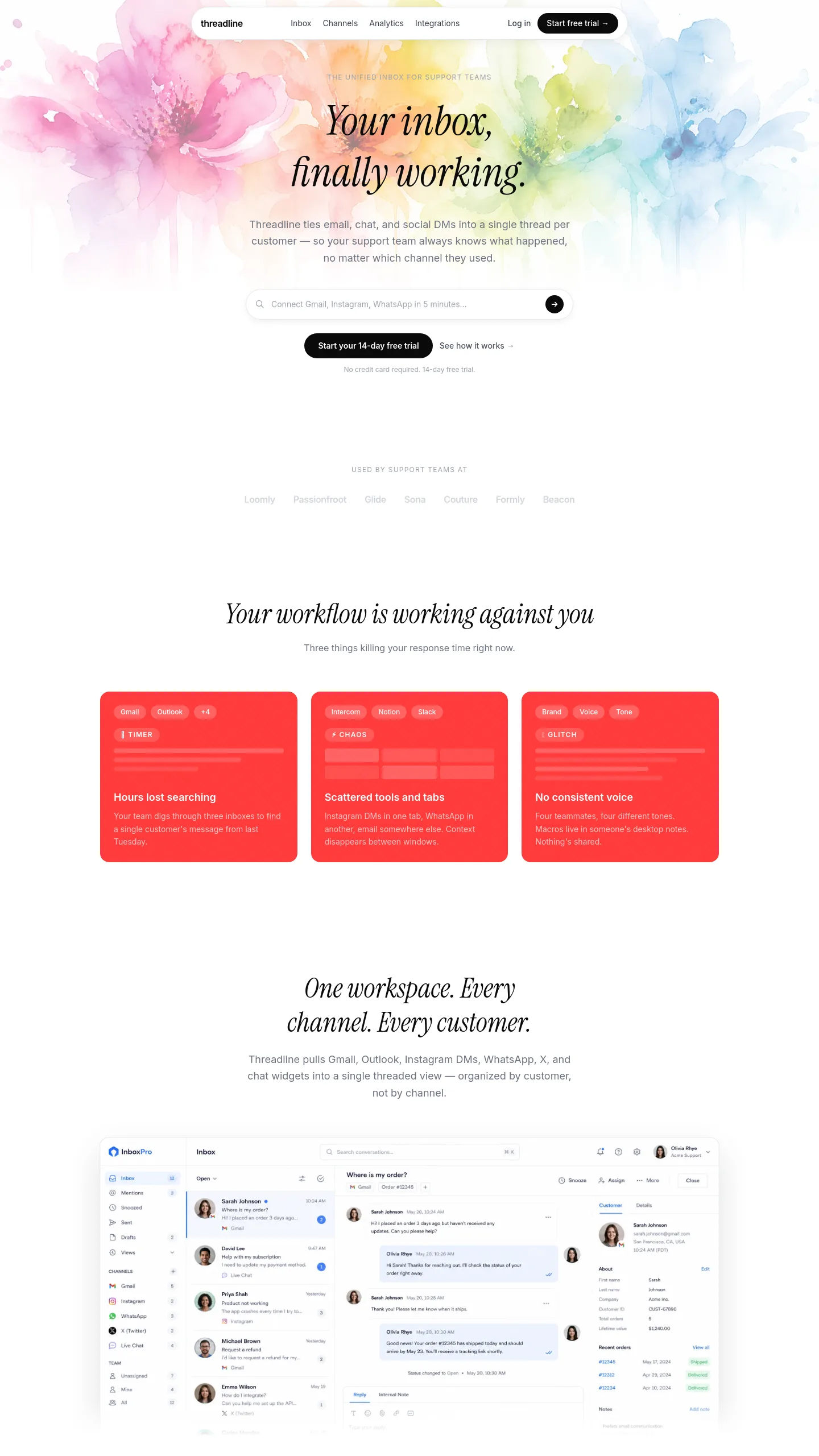

A launch page for a subscription design tool sold to creative teams
Watercolor Code is built for a software company selling a design product on a monthly or annual subscription, with a free trial as the main way in. It suits a small SaaS team (SaaS means software sold as an online subscription) whose product helps designers find, organise or check their work: an inspiration library, a moodboard tool, or an AI assistant for interface design. The buyer it speaks to is a working designer, or a design lead at a brand, marketing team or agency. The page is pitched at people signing themselves up, not at booking a sales call.
The watercolour artwork at the top does a job beyond decoration. It tells a visitor the product was made by people with taste, which is the first thing a designer judges before trying any tool.
What the page already argues, in order
The page follows the sales argument a product like this needs. It opens with a headline and a search bar styled like the product itself, so visitors see the core action before reading anything, with a strip of customer logos underneath. Next, a section names three problems: hours lost searching, scattered tools and tabs, and inconsistent branding. A video slot follows for showing the product in action. A tabbed feature area presents six capabilities one panel at a time, so you can explain a lot without a long scroll. Four cards then address separate audiences, namely UI/UX designers, brand teams, marketing teams, and agencies or freelancers, each with a "learn more" link.
Pricing has three tiers, a monthly or annual switch, and a second switch separating the app from an API offering (an API lets other developers build on your product), with the top tier marked as best value. A free-trial band follows, promising no credit card and backed by a row of security assurances covering GDPR, SSL, encryption and design privacy. After that come a collage of reviews, six FAQ rows, a closing sign-up prompt with a live "designers searching right now" counter, and a footer with four link columns and app store badges.
The work between choosing it and going live
Every word is written around one product called inspoai, so the copy is a full rewrite: headline, problem cards, the six feature tabs, audience cards, tier names, feature lists and FAQs. The customer logos, Trustpilot score, reviews, "150+ teams" figure and live counter are all stand-ins. Replace them with your real numbers or take them out. The security row names specific standards, so keep only the ones you actually meet.
You will need a product demo video. The search bar and AI panel assume your product answers plain-language requests, so if yours works differently, swap those for screenshots. With a single plan or no API, the pricing switches can be simplified. The navigation assumes four content areas, UI files, web inspiration, icons and visual notes, which you would rename to match your own library.