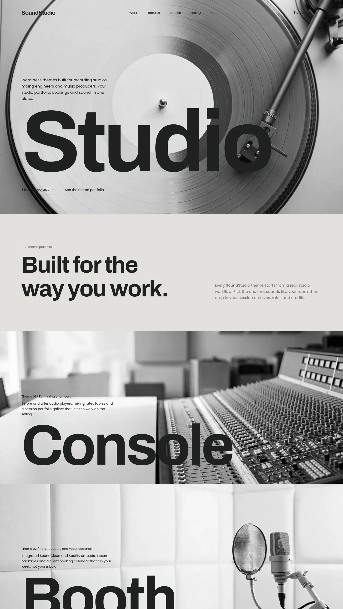

For a studio that sells a sound, not a price list
Vinyl is built for a recording studio whose reputation rests on how its records sound and feel. Think of a small, owner-run room with a tape machine in the corner, a mastering engineer who cuts for vinyl, or a producer who wants visiting artists to sense a point of view before they ever ask about hourly rates. It suits a studio that wins work through referrals and taste rather than one competing on the cheapest day rate in town.
The whole page is black and white, with no brand colour anywhere. For a studio, that matters in a practical way: the page reads as calm and confident, and it leaves room for your artists' cover art and your own logo to carry any colour you introduce later. The turntable photograph tells a visitor straight away that this place cares about the physical record, which is a useful signal if analog recording or vinyl mastering is part of what you offer.
One screen, done properly
Be clear about what you are getting. Vinyl is a single opening screen, the part of a homepage a visitor sees before scrolling. It contains:
- A top navigation with four links and a menu button, which points towards a wider site you would build out behind it.
- A logo area with a headphone icon and a two-word studio name.
- One very large word, "Music", which acts as the headline and does most of the talking.
- A full-width photograph of a record on a turntable that fills the background.
There are no buttons, forms, service lists or pricing sections on it yet. What the template handles well is the hardest part to get right: a striking, uncluttered first screen that sets the tone for everything else.
What stands between this and launch day
The studio name in the template is a placeholder, so your first job is swapping in your own name and logo. Next, decide on the headline. One bold word is the whole idea here, so pick yours carefully. "Music" works, but "Mastering", "Tape" or your studio's name could serve you better.
If you replace the photograph, choose one that is pale and quiet on the left-hand side. The dark lettering sits directly on the image with nothing behind it, so a busy or dark photo would make it hard to read. The tonearm sweeping in from the top right is what balances the layout, so a photo with a similar diagonal shape will keep it looking deliberate.
The navigation text is set quite small, so you would probably enlarge it for visitors on phones and older eyes. Then you would add what clients actually need once they are interested: a booking or enquiry button on this screen, and pages for your rooms and equipment list, rates, past credits and a contact form. Vinyl gives you the tone. Bringing in the work is down to the pages you add behind it.