For a label that sells a feeling before it sells a product
Stillness suits a small lifestyle brand whose customers buy into a way of living as much as an item: homeware, linen, ceramics, slow fashion, skincare, or anything sold on calm and restraint rather than discounts. It was designed around "ryoku", a brand built on Japanese minimalism, and everything about it assumes a founder-led label with a strong point of view and a short, considered range. Think a studio launching its first collection or a boutique with a loyal following, not a high-volume retailer competing on price.
The whole thing is black, white and grey, with no colour at all. That has a practical consequence: your product photography carries the page. If you shoot in black and white or in quiet, natural tones, it will sit perfectly. Bring in colour if your products depend on it, and treat that as a deliberate brand decision rather than a tweak.
What the Stillness opening already does
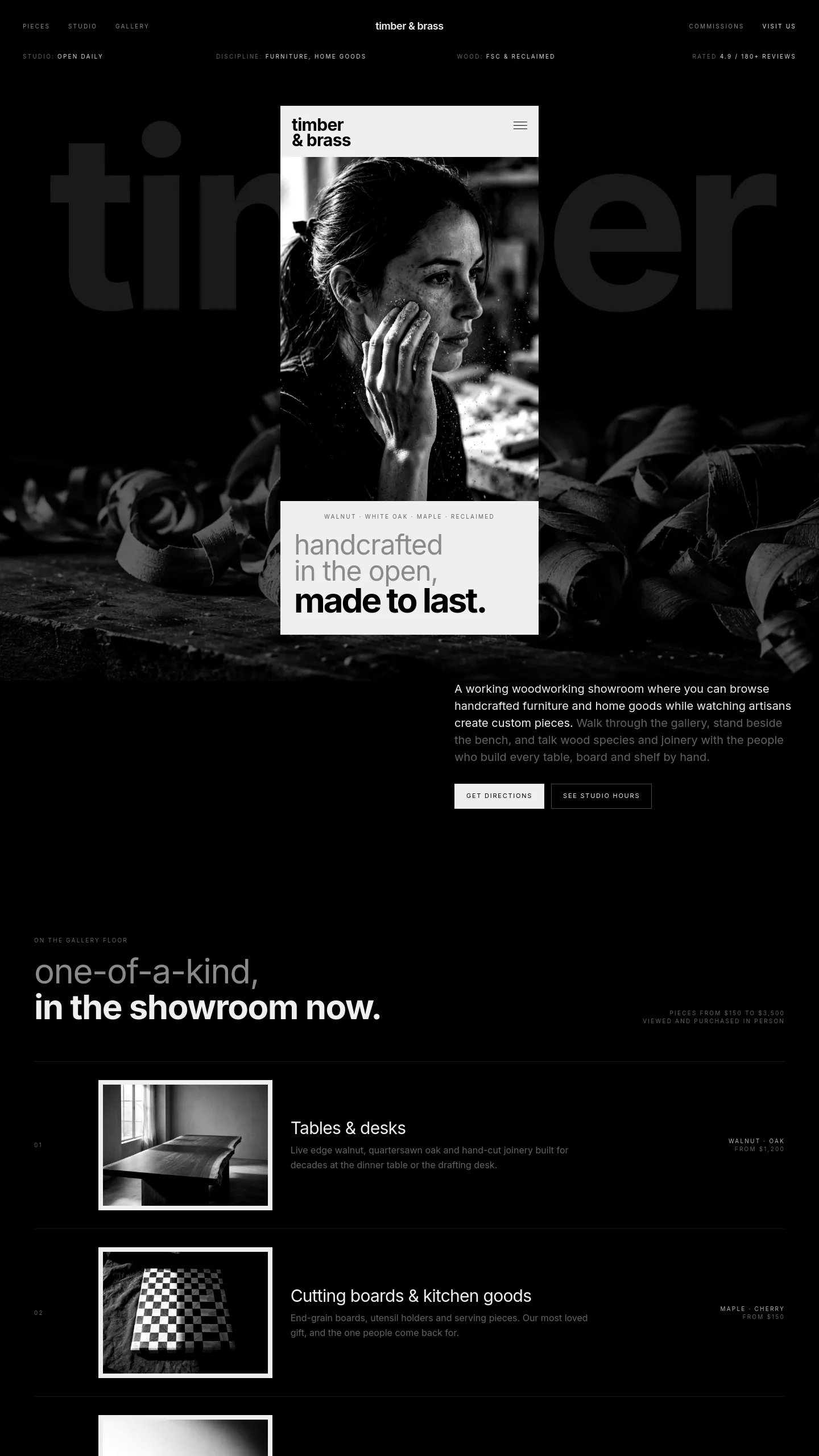
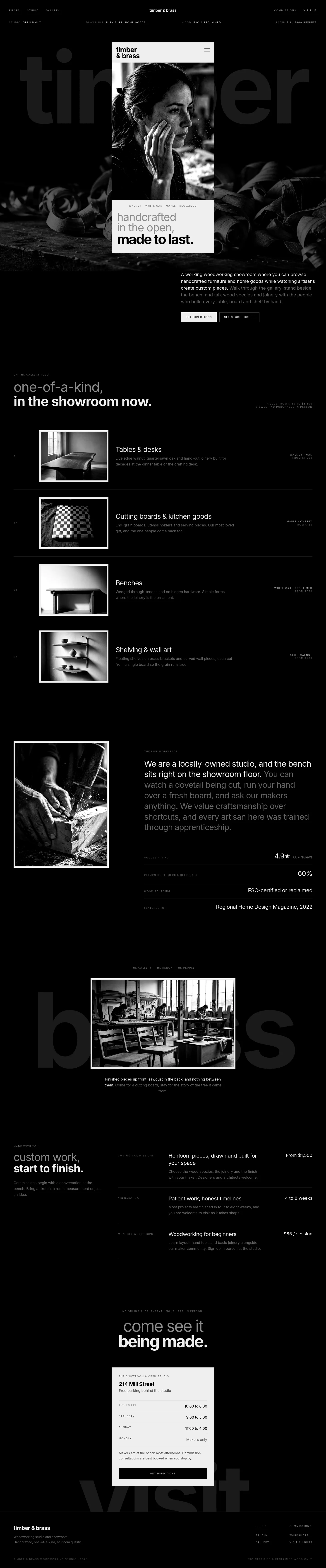
The template is a brand introduction more than a full shop. It is built around a narrow, phone-shaped page that holds your logo, a menu button, a large portrait photograph running edge to edge, a short caption line in small spaced-out capitals, and a stacked headline that builds up to your brand name in heavier type. Behind it, your brand name runs huge and faint across the background, and a band of draped fabric photography gives the composition texture.
Below that sits a short statement of intent, a few sentences on what the brand stands for. It uses one quiet trick worth keeping: the opening words are bright and the rest fade to grey, so the important part stands out without anything shouting. There is no sales language anywhere, which is the point. It reads like a gallery wall rather than a shop window.
The work between choosing it and taking orders
Be clear-eyed about effort here. What you get is the mood, the type and the opening; the selling parts are yours to add. You will want to build product listings, individual product pages, a basket and checkout, plus any shipping, returns and contact information. You would also add buttons and links, since the design currently has none beyond the menu.
The copy needs rewriting throughout: the headline words, the caption line and the statement are all written for ryoku. The two photographs, a close black-and-white portrait and the fabric study, should be replaced with your own, ideally shot in the same high-contrast, unhurried style so the pages you add later feel like they belong. The project, discipline and year labels across the top come from a portfolio presentation and can simply be removed.
If that sounds like a lot, it is worth weighing against what is hard to buy: a finished brand voice and visual restraint that most store templates never manage. Stillness gives you the hardest part, the feeling, and leaves the shelving to you.