
For advisers whose clients are already half-convinced
Precision is written for a consultancy that wins work through referrals and conversations, not through a website that has to persuade a stranger in five seconds. The sample business is an operations and systems consultancy for travel and hospitality teams, and the tone fits that kind of practice closely: an independent consultant or a small partnership advising operators, finance leads or heads of department on how their tools, processes and teams fit together. IT consultants, operations advisers, interim managers and specialist strategists will recognise the register straight away.
The page makes a confident claim in two short sentences, explains it in one paragraph, and then stops. There is no button in the main area asking the visitor to book a call. The only invitation is a "Start a project" link in the navigation. That restraint is the point. It reads as a firm with enough work that it does not need to chase, which is exactly the impression a senior adviser charging day rates wants to give a procurement lead who has just been handed their name.
What is on the screen today
Precision is a single opening screen, not a full site. It contains:
- A navigation bar with your name or logo and five links, one of which is "Start a project".
- A two-sentence headline that states what you deliver, set on the opposite side of the page from a short explanatory paragraph, so the promise and the explanation carry equal weight.
- A thin row of details running the full width: a date, a timezone, a region and a local time. For a consultant who works across borders or with remote clients, this quietly says where you are based and when you are reachable without a contact block.
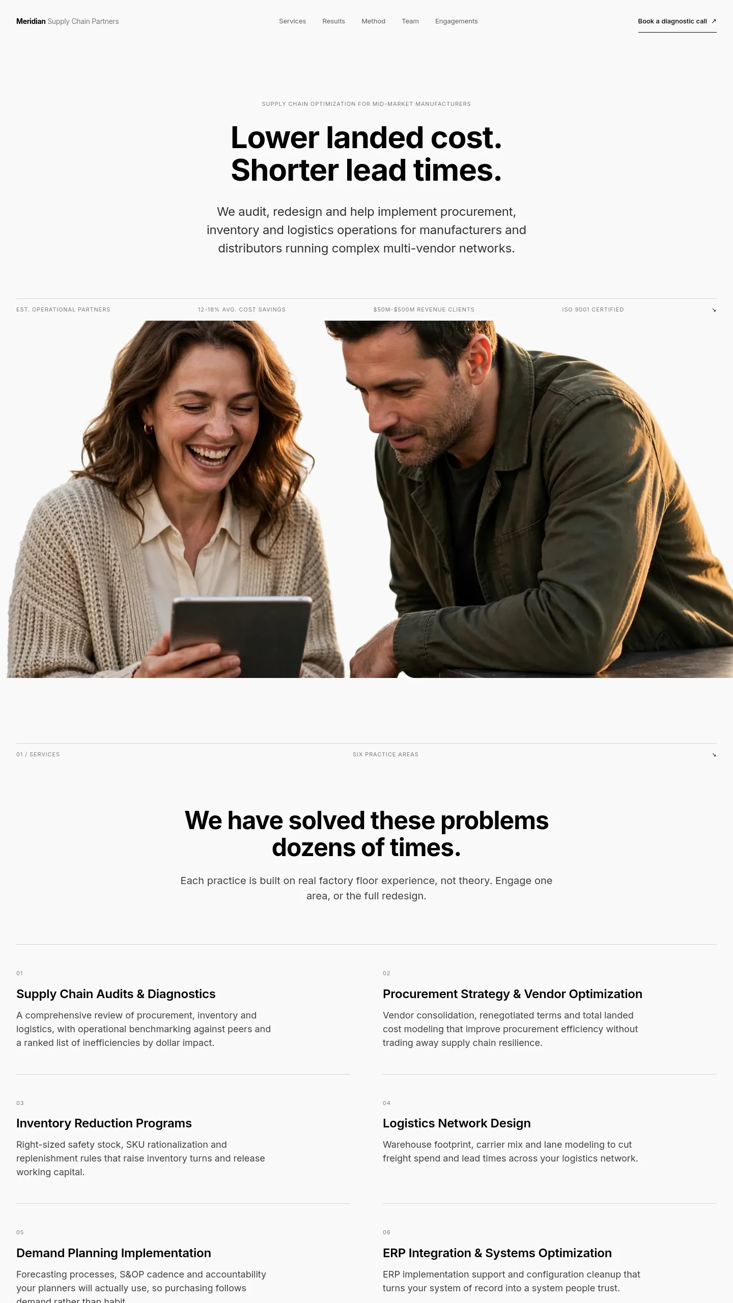
- One large photograph of people working together, kept separate from the text rather than placed behind it, so the words stay easy to read.
The work between choosing it and going live
The copy is the main job. The headline and paragraph are specific to hospitality systems work, so you will rewrite both around your own outcome. Keep them short; the layout depends on two crisp sentences, not a list of services. Change the region and timezone in the details row to your own.
The photograph should be of you or your team, ideally a real working moment rather than a stock handshake. The sample image is warm and candid, and a similar shot of your own will do more for trust than anything else on the page.
Beyond that, the five navigation links point to pages that are not part of this template. Plan to add the pages behind them yourself, typically services, case studies, an about page and a contact or enquiry page. If you want enquiries to come in from the opening screen, you would add a short line with your email address under the paragraph rather than a large button, which keeps the measured tone intact.