
Built for a self-serve product that people try before they buy
Ink Drift suits a SaaS company where customers sign up and start using the product without booking a demo first. The whole page pushes one action, starting for free. That button appears at the top and again near the end, and the first one has a short line beneath it that takes away a reason to hesitate. In the original that line reads "No signup required". This makes Ink Drift a natural fit for a freemium or free-trial tool sold to individuals and small teams. It also suits a product-led company, meaning one where the product itself does most of the selling. The hand-drawn doodles give the brand a friendly, independent personality. That helps when your buyers are creators, marketers and small teams rather than procurement departments.
A long page that answers the evaluator's questions in order
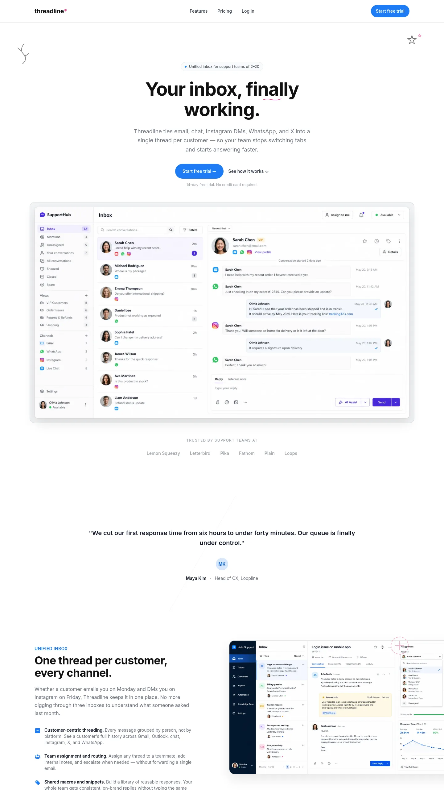
The template is a single scrolling page, laid out in the order a person trying out software tends to ask their questions. It opens with a headline promise, a product screenshot and a row of customer logos with a user count. Next come several feature chapters. Each one has a large product screenshot and a grid of short capability blocks. The chapters cover the core value, the deeper power-user features, customisation, sharing, and the other tools your product connects to. Four short customer quotes sit between those chapters, so proof from real users keeps turning up as visitors scroll.
A "designed for you" section then breaks use cases down by role, giving six audiences a few bullet points each. The page ends with a final free-start call to action and a questions and answers accordion, which is a list of questions that open up when clicked. Below that is a large footer with columns for product, help, company and resources, plus links to pages comparing you with competitors. The header carries pricing, log in and sign up links.
What you will rewrite before launch
Almost every word and image is written for a form builder, so plan to replace them. The product screenshots are the biggest job. There are several large ones plus smaller ones inside the sharing cards, and all of them need to be real captures of your own interface. The capability grids hold about six items each across four chapters, so you will need roughly two dozen features with short descriptions. If your product is simpler, merge or drop chapters. You will also swap the integration tiles for the tools you actually connect to, the role personas for your own audiences, and the logos, user count and quotes for your own customers. The comparison links in the footer only make sense if you have written "alternative to" pages, so keep them only if you have. The doodles are a big part of the character. If you want new illustrations in your own brand style, budget for an illustrator.
If you sell to larger companies through a sales team, you would add a "talk to sales" button next to the free-start one, plus a section on security and compliance.