For the broker whose clients see property as an asset
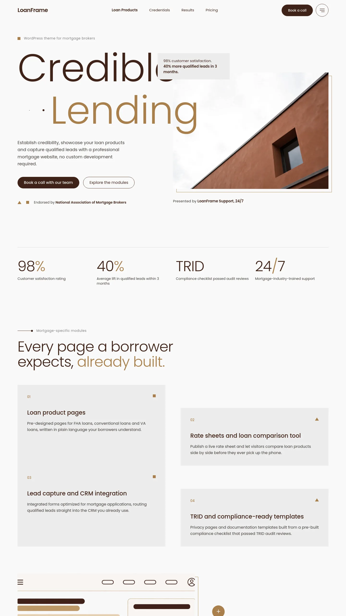
Ember Earth is built around one photograph of a building shot from below. There is no front door and no family on a sofa. That tells visitors the firm sees property as something to finance, hold and grow. It suits a brokerage that arranges commercial mortgages, buy-to-let portfolios, development finance or bridging loans (short-term borrowing that covers the gap before a sale or refinance). Its clients are landlords, investors and company directors rather than first-time buyers.
The layout began as the opening slide of a presentation, and it still feels like one. If you pitch to developers, run landlord seminars, or present to the estate agents and accountants who refer clients to you, Ember Earth gives your website and your pitch deck the same look. Someone who sat through your talk then lands on a site that looks like the talk.
What the opening screen already does
At the moment the template is a single opening screen, carefully put together. It has:
- a header with your logo, your firm name, three navigation links and a round button that opens a fuller menu
- a large two-line headline, with the second line in a contrasting tone so one word carries the emphasis
- a short caption panel that sits partly over the photograph, with room for two lines saying what you do
- a presenter credit, made of a label and a name, which works as "Advice led by" followed by your principal broker
- one architectural photograph, plus a few small graphic marks that finish the screen
The colours are warm and restrained, and the photograph supplies the only strong colour. That keeps the site serious enough for a client arranging a large loan, without making it feel like a bank.
From Salford & Co. to your firm
The headline currently reads "Real Estate" and the firm is called Salford & Co., so both change first. The split headline needs two short words, so pick a pair that names your specialism, such as "Commercial Finance" or "Portfolio Lending". Rewrite the caption as a plain statement of who you lend to, and put your own name in the credit.
Choose the photograph with care. The caption panel sits over the empty sky in the picture, so you need an image with clear space in its upper left. A building of the kind you actually finance works best.
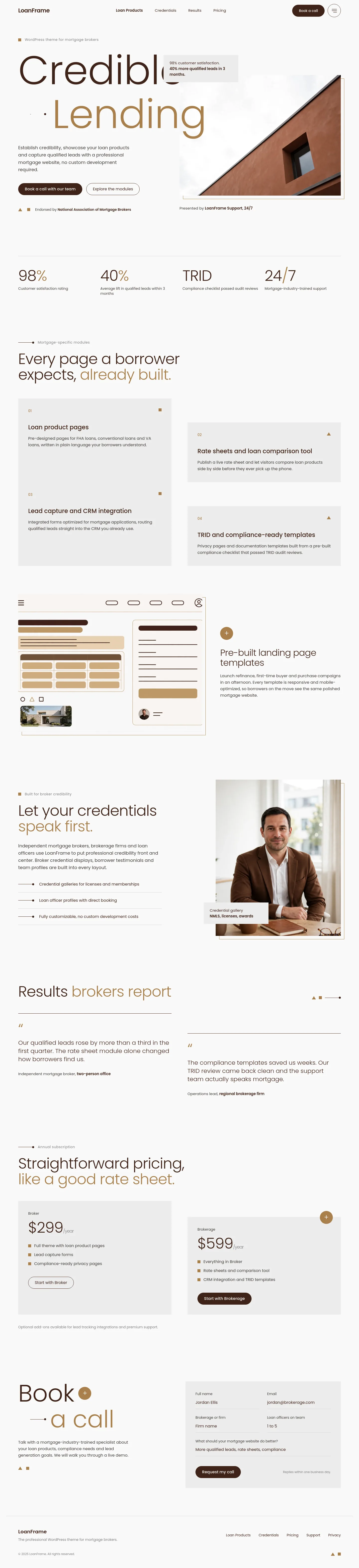
Everything beyond this screen is yours to add: pages for each type of loan, an enquiry form, your regulatory disclosures and fee information, and a phone number in the header if your clients expect to call. Plan for that as real build work, not small tweaks.
Where Ember Earth sits among the three
Page Overview centres on the adviser and on clients who arrive by recommendation. Fieldstone speaks to someone picturing the home they want to buy. Ember Earth is for a firm that presents its lending expertise to professional and investor clients and wants its website to sound as polished as its boardroom pitch.