For a business that pours the wine rather than grows it
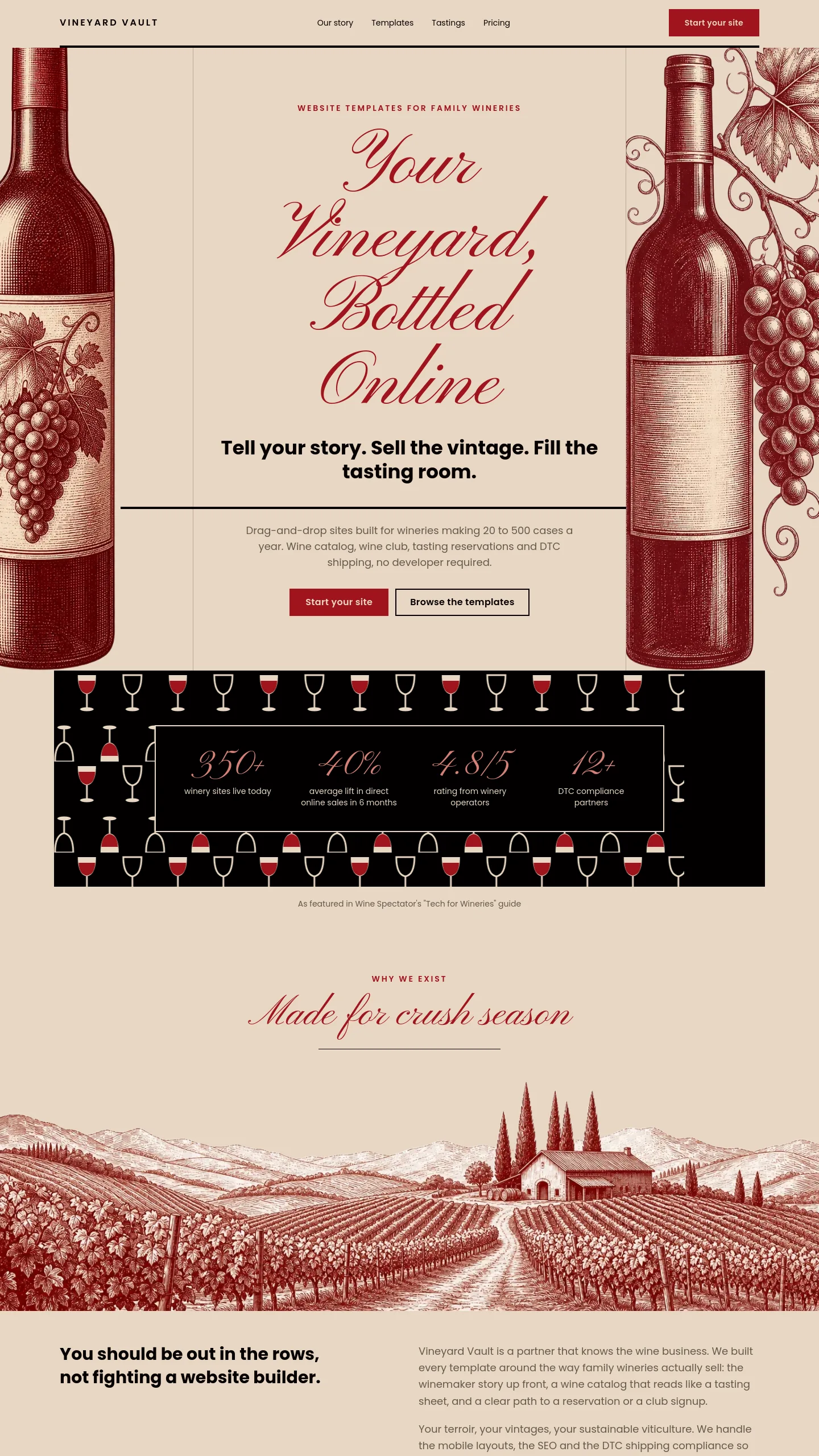
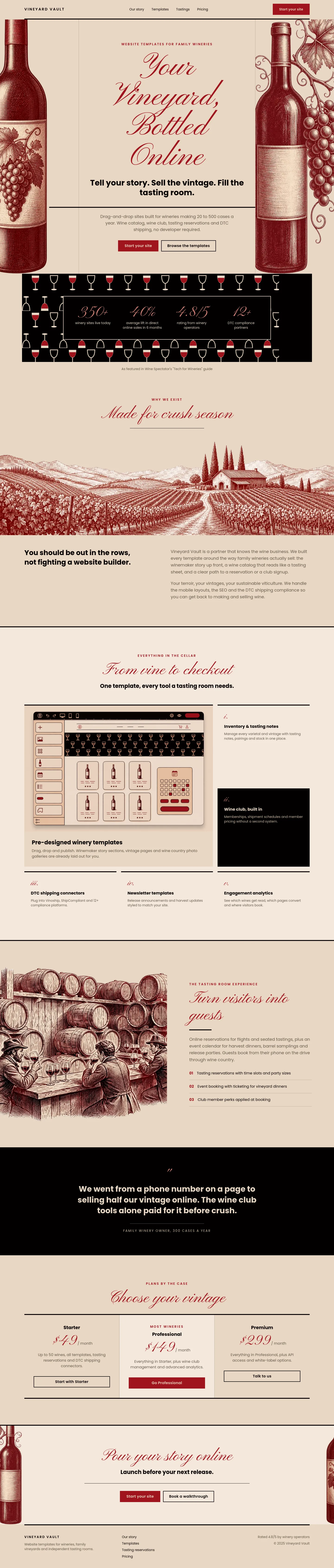
Burgundy Elegance is about the glass and the bottle, not the vineyard. It doesn't show rows of vines or harvest photography. It uses engraved-style bottle illustrations and a repeating pattern of wine glasses, in the style of an old wine label or merchant's catalogue. That suits a business whose customers come to taste, learn and drink: a tasting room, a wine bar, a café with a serious wine list, a merchant running evening flights, or anyone hosting wine education sessions.
The design was built around a café presenting "The World of Wine", so its natural job is to announce an experience. If your selling point is "come and spend an evening with us and a few bottles", the tone is already right. Because everything is drawn rather than photographed, you don't need a photo shoot to launch. That helps if your premises are small or your vineyard isn't yours to photograph.
One screen, and what it already says for you
This template is a single screen, not a multi-page site. It contains:
- A header line with your business name and mark on the left and your web address on the right, sitting on a ruled line like the top of a printed label.
- A headline in formal script with a plain, bold line beneath it. In the original these read "The World of Wine" and "Discover the Elegance Behind Every Bottle".
- A short caption under a second rule, for a date, a location or a one-line invitation.
- A decorative band of interlocking wine glasses that fills the lower half and works like wallpaper.
- Two bottle illustrations framing the screen, with grape clusters on their labels.
There are no buttons, forms or content blocks. It works as a landing page, an event announcement or a holding page while a fuller site is built.
The work between choosing it and launching
The copy is the main job. Swap in your own name, web address, headline, sub-line and caption. The script lettering suits short, warm phrases, so a tasting title or a season name will sit better than a long sentence.
Most businesses will then add a few things. Customers who book a tasting or reserve a table need a way to act, so you would add a booking button or a phone number beneath the caption. Opening hours and an address would also go in that lower area. If you want separate pages for a wine list, events or private hire, you would build them, ideally carrying over the rules, the single deep red and the engraved illustrations so they match.
The colour scheme uses one wine red with sand and black. That makes it easy to keep consistent with menus, tasting cards and printed flyers.
Choosing between this and Sage Harvest
Sage Harvest suits a winery whose story is the land itself. Burgundy Elegance suits a business whose story is what happens once the cork is out: the tasting, the evening, the knowledge behind the bottle. Pick this one if people visit you to drink and learn rather than to walk the vines.