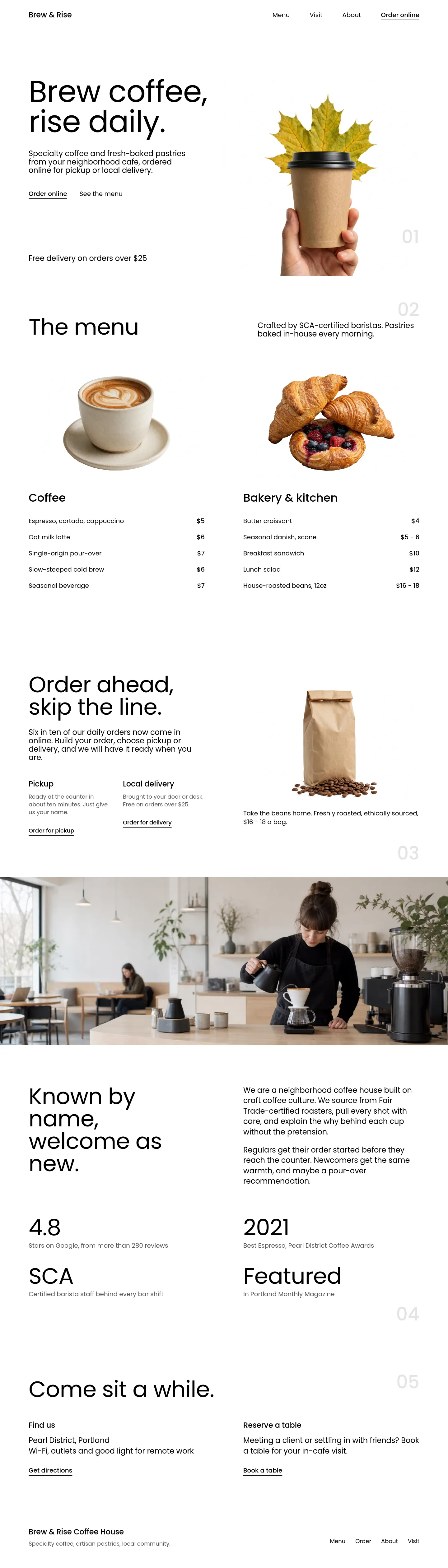
For a café whose best advert is the cup in a customer's hand
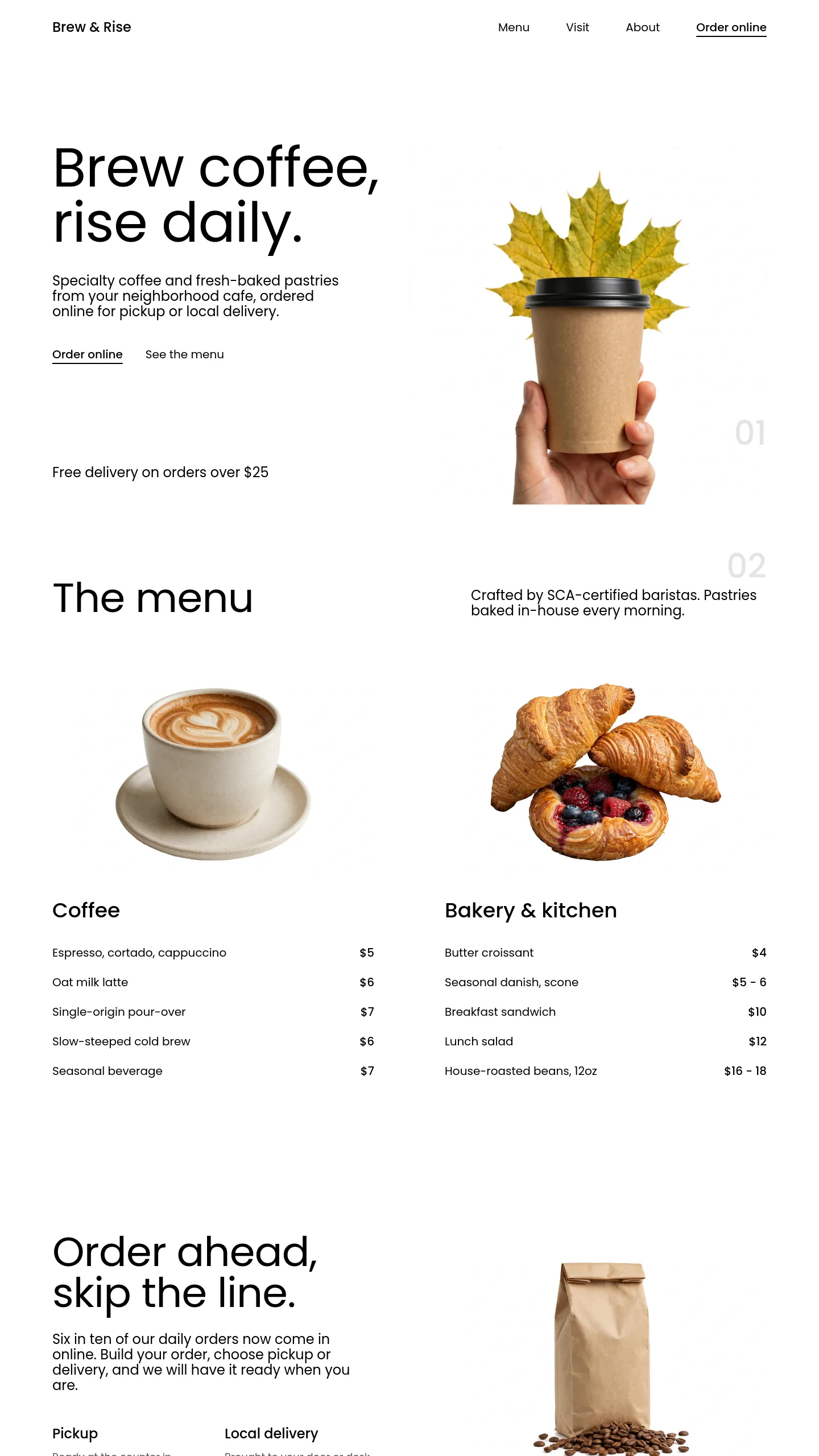
Blank Canvas suits a coffee shop that sells mostly to people on the move: a takeaway counter near a station, a kiosk in an office lobby, a small independent that has just opened and wants to introduce itself in a sentence rather than a brochure. The whole page rests on one photograph of a hand holding a takeaway cup. Everything else is plain black text on white, with no brand colour at all, so the warmth of your coffee and your packaging has to come from your own photo.
That makes it a good match for an owner with a strong product shot and not much else yet. You don't need a finished logo palette, a library of interior photos or a long menu to make this look complete. It also fits a café with a seasonal identity. The sample image pairs the cup with an autumn leaf, and swapping that one picture for a summer iced drink or a winter cup changes the mood of the whole page without touching anything else.
One screen, already written around a single introduction
Blank Canvas is one screen, not a multi-page site. It was built as the opening slide of a "Coffee Shop Introduction" presentation, and that shapes what it contains:
- A header with your business name, two text links and a menu icon (the three-line "hamburger" button that usually opens a list of pages).
- A large two-line headline set with generous spacing between the lines, which makes the page feel unhurried rather than pushy.
- A short three-line paragraph for what you serve and why it is worth the walk.
- A one-line credit, currently naming the person presenting.
- The cut-out photograph, which sits straight on the white page with no frame.
- A faint "01" in the corner, left over from its slideshow origins.
Because it began as a slide, it also works as a pitch. If you are introducing your café to a landlord, a wholesale customer or an office manager about a coffee contract, it can do that job as it stands.
Between choosing it and opening the doors
The writing is the easy part: replace the sample business name, the headline, the paragraph and the presenter credit, which currently names a person who doesn't exist. The photograph matters more. It needs to be a cut-out, meaning the background has been removed so your cup or pastry sits directly on the white page. A phone snapshot with a counter behind it will look boxed in. Budget for a proper product shot or a background-removal tool.
There are no buttons, forms or contact details yet. If customers need to find you, you would add your address, opening hours and a map link under the paragraph. If you take orders online, you would add a clear order button, since the template has none. The two header links and the menu icon need somewhere to point, so you would build a menu page and a find-us page behind them, or remove them. Decide whether to keep the "01". It reads as decoration, but it can go.